Chikki & Namkeen
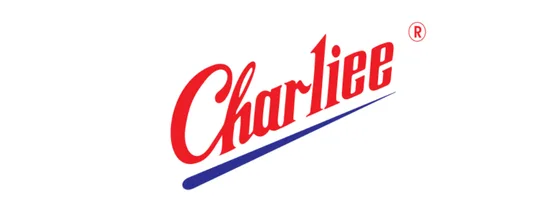
Charliee
A snack brand needs a wordmark with a crunch. We gave Charliee an energetic, moreish script with a confident blue swoosh — a name that's as easy to reach for as the chikki in the jar.
A logo is where it starts, not where it ends. We give a brand a name, a look and a voice — then put it where the world can see it. Below: every brand we've lit up, and the story of how.
Real identities, real colours, real businesses. One obsession: make every one of them impossible to miss.
No secret sauce — just a stubborn process. Six moves, every time.
Every brand mumbles before it speaks. We find the voice already in there — in how you talk to customers, what you're proud of, what you'd never say.
The two or three things your brand can't shut up about. Nail those and the strategy writes itself.
A logo isn't art — it's a signature that survives a 16-pixel favicon and a forty-foot hoarding, and still looks unmistakably like you.
Type, tone, colour, the rhythm of a sentence. How the brand texts, argues and flirts. Most agencies stop at the logo. We start here.
A kit anyone on your team can pick up and wield — colours, type scale, rules of the road — without ringing us at midnight.
Then we put it where eyes are. The good ones get noticed. The numbers follow — they always do.
Where the logo, the type and the story meet — a handful of identities we're especially proud of.
A snack brand needs a wordmark with a crunch. We gave Charliee an energetic, moreish script with a confident blue swoosh — a name that's as easy to reach for as the chikki in the jar.
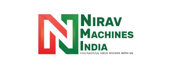
Heavy engineering, set with the tolerances of a machined part. Bold green-and-red letterforms and an interlocked NM monogram say one thing before you read a word: precision.
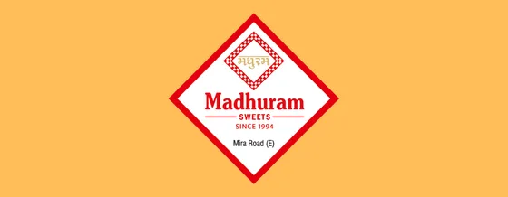
Three decades of mithai deserve a serif as rich as the sweets. A red-and-saffron diamond, Devanagari and English side by side — heritage that still feels fresh on the shelf.
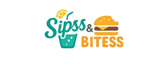
Drinks in teal, bites in orange — an identity you can almost taste. A playful two-tone wordmark with a glass and a burger that makes the menu feel like a treat.
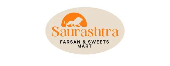
Gujarati farsan, proud as a Gir lion. A warm orange serif under a rising-sun emblem — heritage snacks made to look as hearty as they taste.
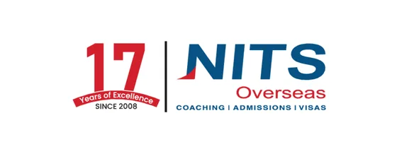
Seventeen years of sending students across the world, in a wordmark that already has its visa stamped. Confident blue-and-red type that reads as trusted, established, ready for departure.
Your brand's out there. Let's bring it to light.